Redesigning English learning app
About the project
*This is a conceptual case study with no affiliation to BBC. BBC Learning English, part of the renowned British news channel, provides high-quality free content through its website and app. I chose to redesign it due to the potential for improving the app's user experience.
My role
As the sole designer, I led the entire UX process from start to finish. My role included conducting user research, creating wireframes, and running usability tests to gather feedback. I then finalized the design, ensuring a more intuitive and user-friendly experience for the app.
Research
I initiated the redesign process by conducting a competitive analysis, a brief survey, and analysing feedback from current users during the Emphasize phase.
Competitive analysis
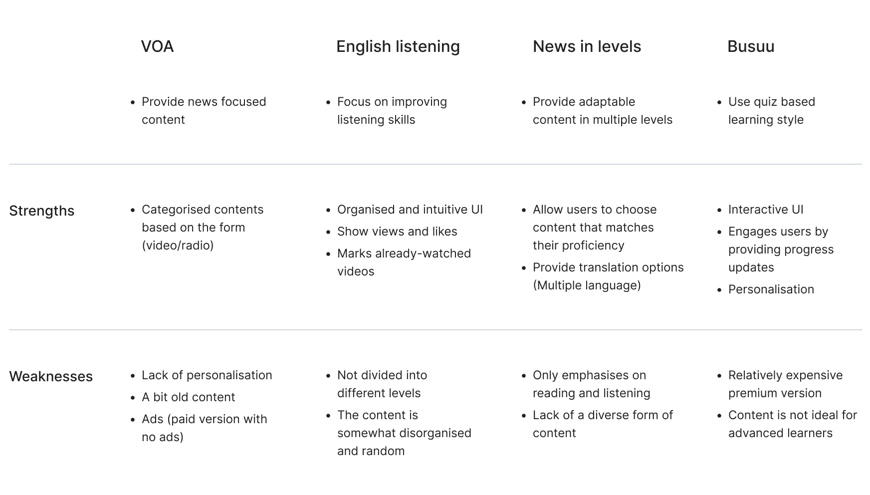
I conducted a competitive analysis of BBC Learning English's app, comparing it with VOA, English Listening, News in Levels, and Busuu.
Throughout this process, I identified BBC's strengths, which include providing high-quality news-based content and supporting various learning styles through content in drama, pronunciation, grammar, and more. Additionally, all of these features are available without ads, and the service is free. On the downside, there is room for improvement in certain aspects, such as navigation and the video user interface, making it less user-friendly compared to other apps.
Survey
In the next step, I conducted a brief survey with 8 individuals currently studying English and who had never used BBC English Learning app before, analysing their feedback on the app.
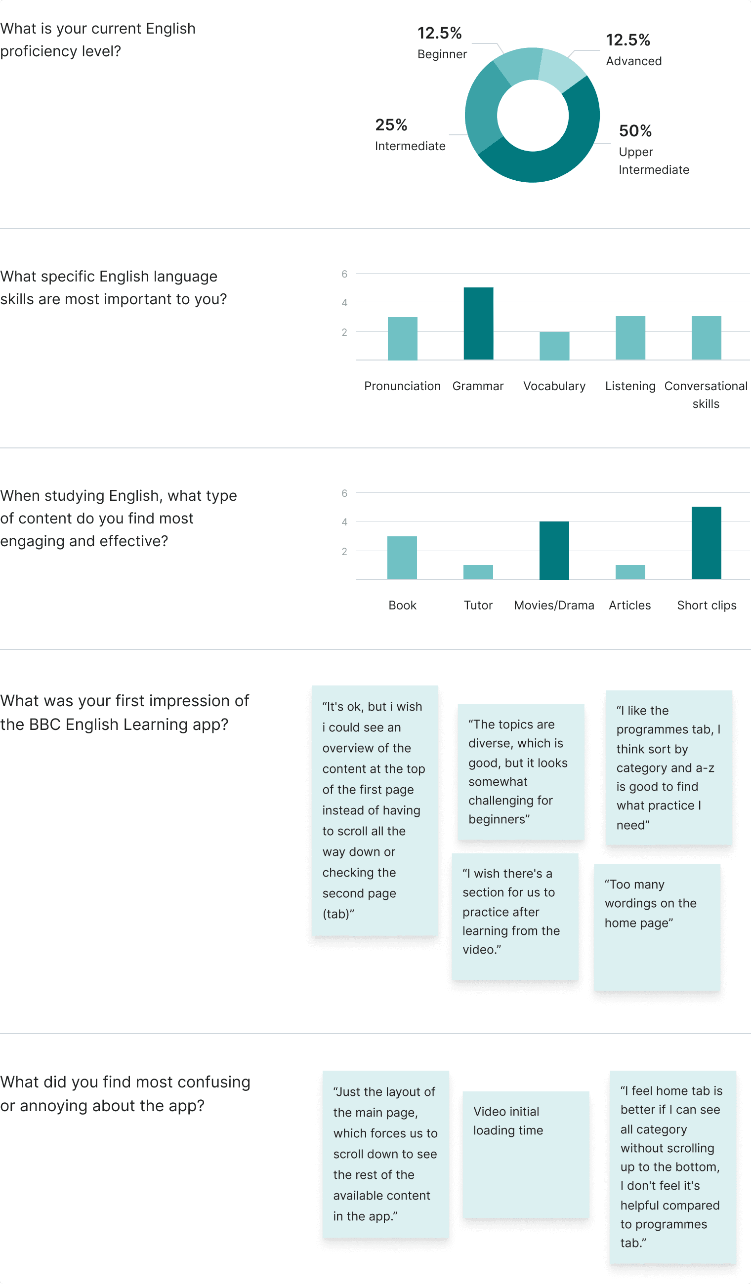
- When choosing the English learning app, participants consider the following factors: How engaging the content is, and how easy to navigate the app, Syllabus, Instructor clear pronunciation
- While using the BBC Learning app, 75% of users used ‘Home’ to find the specific video they wanted to watch, and 25% used ‘Programmes’
- While using the BBC Learning app, 87.5% of users used the Default screen when they play the video/audio, and 12.5% used full-screen.
Evaluate user feedback
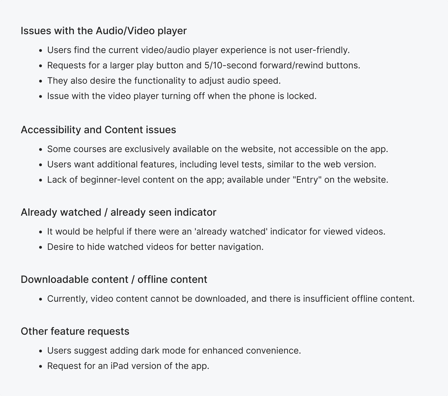
After the user survey, I analysed actual user evaluations through online app reviews, blog reviews, etc., discovering several common feedback points:
Define
Persona
To better understand users' needs and motivations, I created a persona:

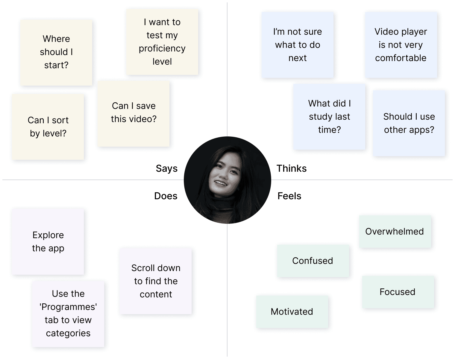
Empathy map
Then, I created an empathy map focused on users' behavior when using the app to gain a deeper understanding of their experiences.
Problem statement
How might we improve the user experience to help users discover the content that is right for them?
Ideate
Solutions
Through the Emphasize and Define stages, I identified several issues and proposed the following solutions for each problem.

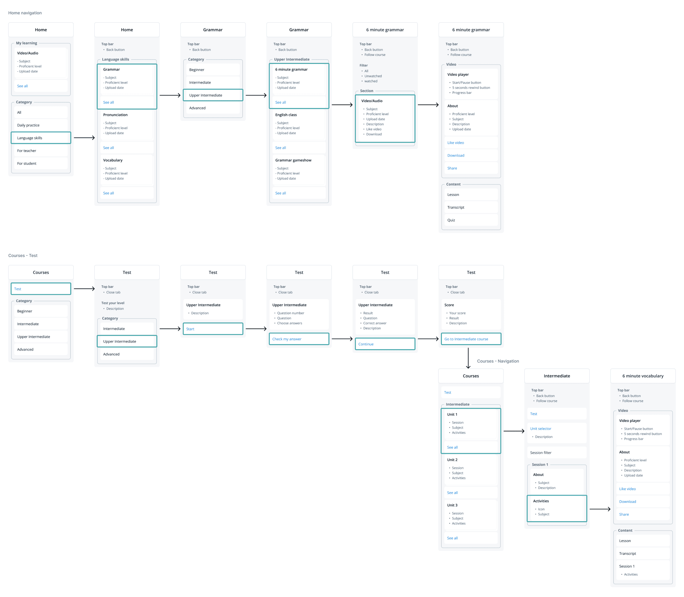
Information architecture
Based on what was defined in the solution above, the direction for this redesign focuses primarily on two aspects: enhancing the 'Home' navigation and introducing a 'Courses' menu. With this in mind, I proceeded to create Information Architectures for these two journeys.
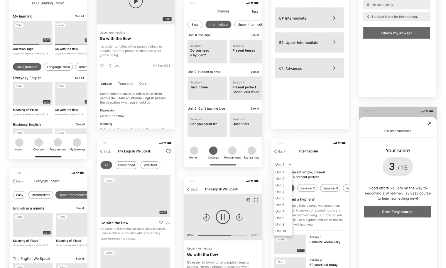
Mid-fidelity wireframe
Then, I created mid-fi wireframes to visually present the proposed changes and ensure a cohesive user experience.
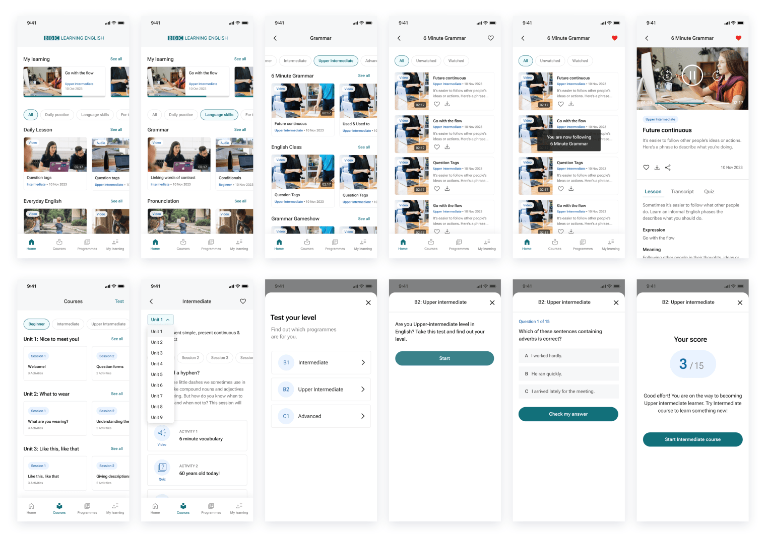
High-fidelity wireframe
Based on the mid-fi wireframes, I further developed and refined the design to create the first version of hi-fi wireframes, incorporating more detailed visual elements and features.
Test
Usability testing
After completing the high-fidelity design, I conducted usability testing with 4 participants through Google Meet. I provided tasks, requested them to share their screens, and observed their actions.
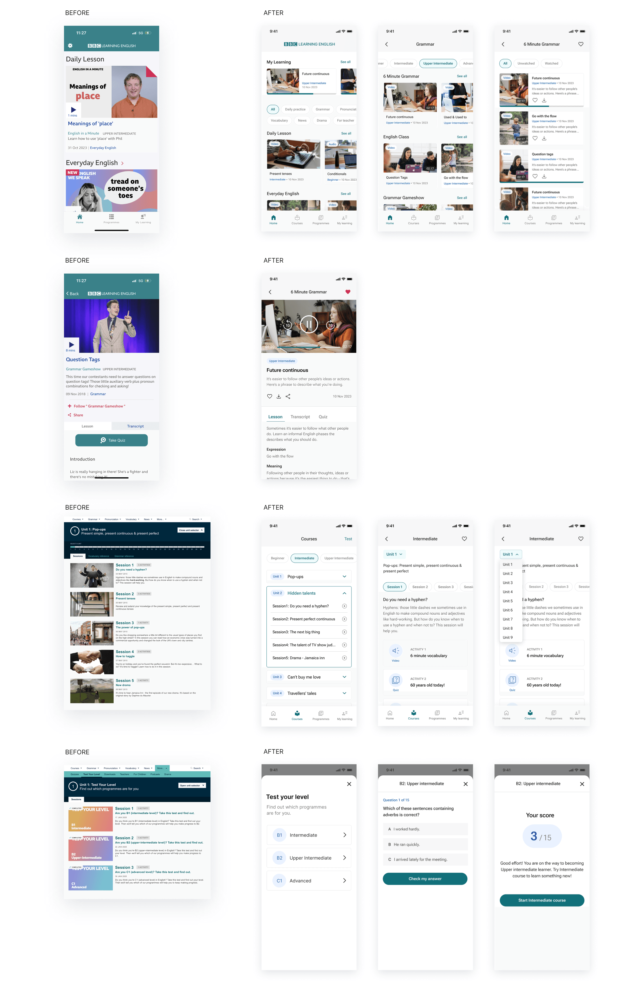
- Task 1: Navigate to the grammar lecture from the home screen, and take the lecture.
- Task 2: Take a level test in the 'Courses' menu and explore a lesson that matches your proficiency level.
Following the usability testing, I made the following changes based on their feedback and observations.
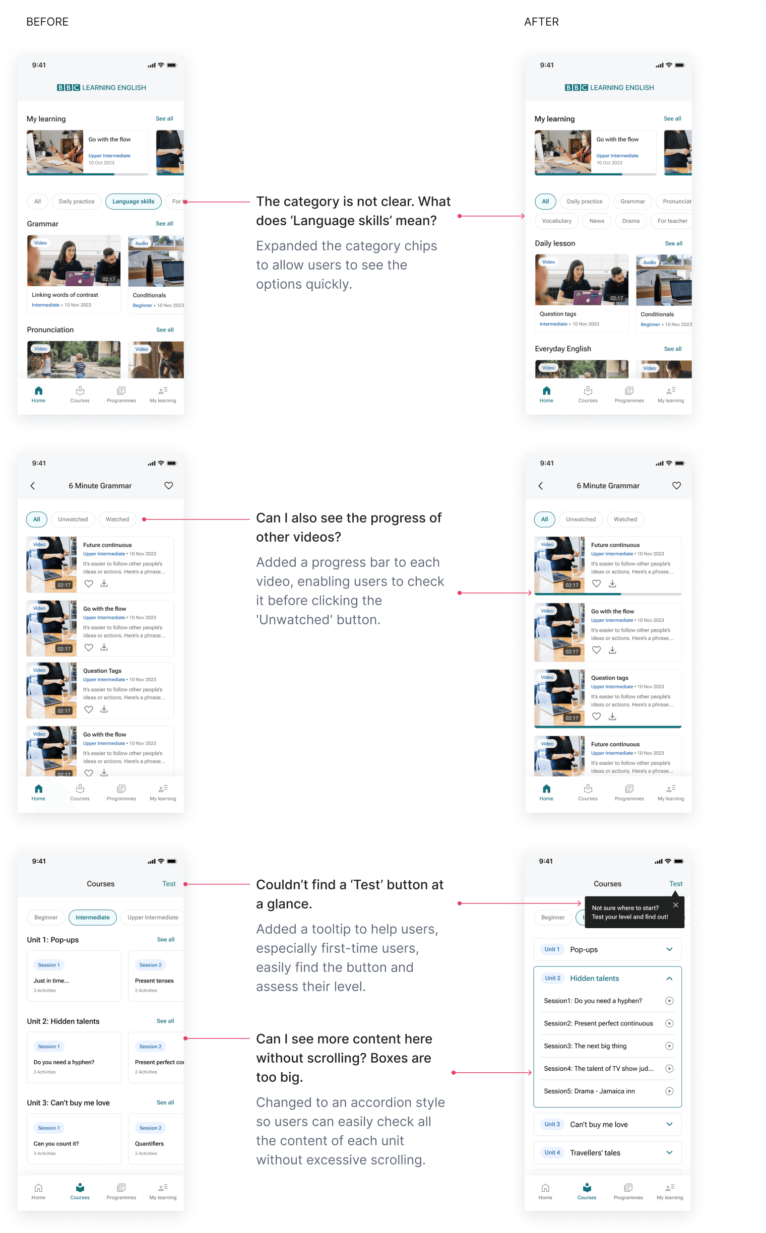
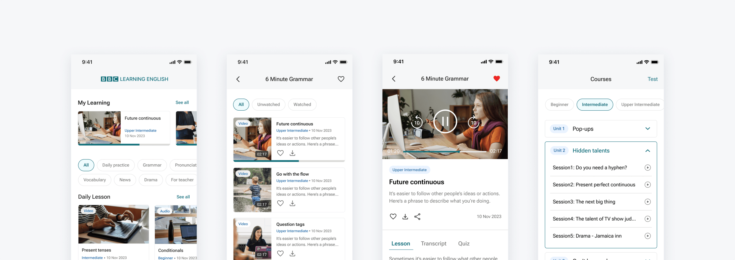
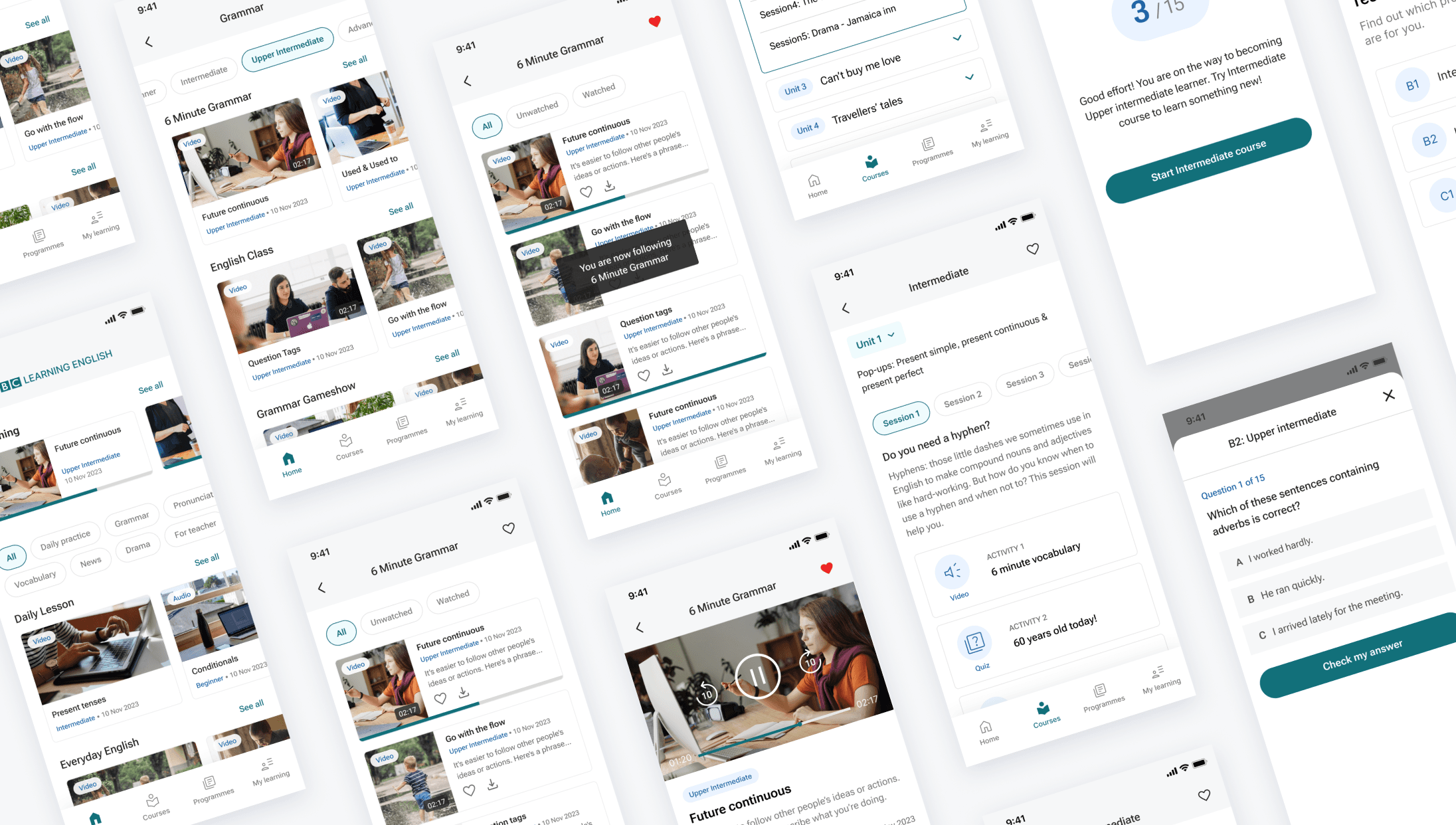
Final design
Here is the final design, compared with the original app and website.
Learning
Even though it was a conceptual redesign project, going through every stage, including research, surveys, and the define process, from start to finish was an incredible experience.
Particularly, understanding things from the user's perspective through surveys and usability testing differs from just thinking about it, and I realized the importance of hearing directly from users.
It was a great opportunity to learn that robust research and define process is essential to produce meaningful and persuasive outcomes.