Interactive demo for a cybersecurity product
- Client
- SecureAge Technology
- Role
- Creative Designer
- Year
- 2023
About the project
Security Suite is the flagship product of SecureAge, a cybersecurity company focused on data protection. This project is an interactive product demo built on the real product interface, letting users explore key workflows directly on the website and understand how the product works, without needing a sales-led walkthrough.
My role
This project started from something I noticed rather than a brief I was handed: our product was powerful but hard to grasp without a sales-led walkthrough. I led it end-to-end, from research and concept through to implementation, working with C-level, marketing, and sales to define which workflows to show and how to frame them.
The problem
The product had an outdated UI and was primarily explained through text and illustrative content, making it difficult for users to understand how it works in practice. Access to the real product experience was limited to sales-led demos, creating a gap between initial interest and actual understanding.
To address this, I set out to identify the most effective way to showcase the product online by combining competitive research with insights from the COO, CMO, and sales team.
Research
Customers want to see how a product actually works, even if the interface is not visually polished. Most competitors showcase their products through screenshots, videos, or guided demos, helping users quickly understand both functionality and differentiation. This makes the product more tangible early in the decision-making process.
Design strategy
I explored several ways to present the product, from static visuals to guided tours, and landed on a lightweight, interactive approach I could execute with existing resources. A few decisions shaped it:
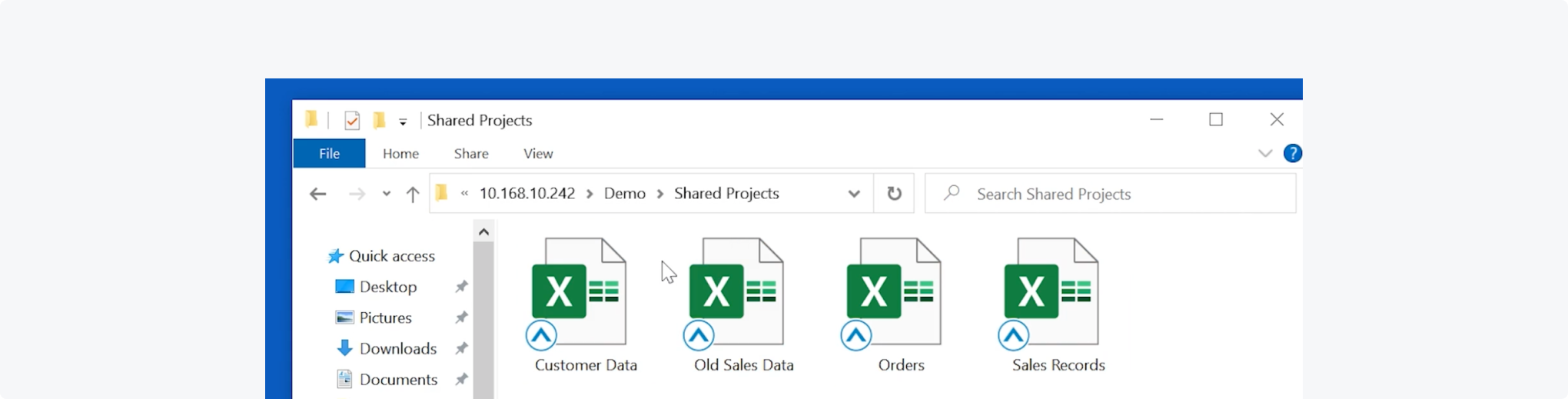
Focused, scenario-based
Rather than showing the entire interface, I focused on a few key interactions and framed them around familiar workflows like handling emails or sharing files, so users could relate the product to their daily tasks.
Motion + interaction
Key actions like encryption were shown through motion, and the demo was built for step-by-step interaction so users could actively engage rather than passively watch.
Leverage available resources
Instead of relying on external tools or agencies, I produced the demo myself with a developer, which allowed faster iteration and full control over the experience.
Process
Structuring the demo
I worked with the COO to identify the most important features from a sales perspective. We focused on three key capabilities — proactive encryption, invisible encryption, and secure collaboration — and translated them into a self-guided experience.
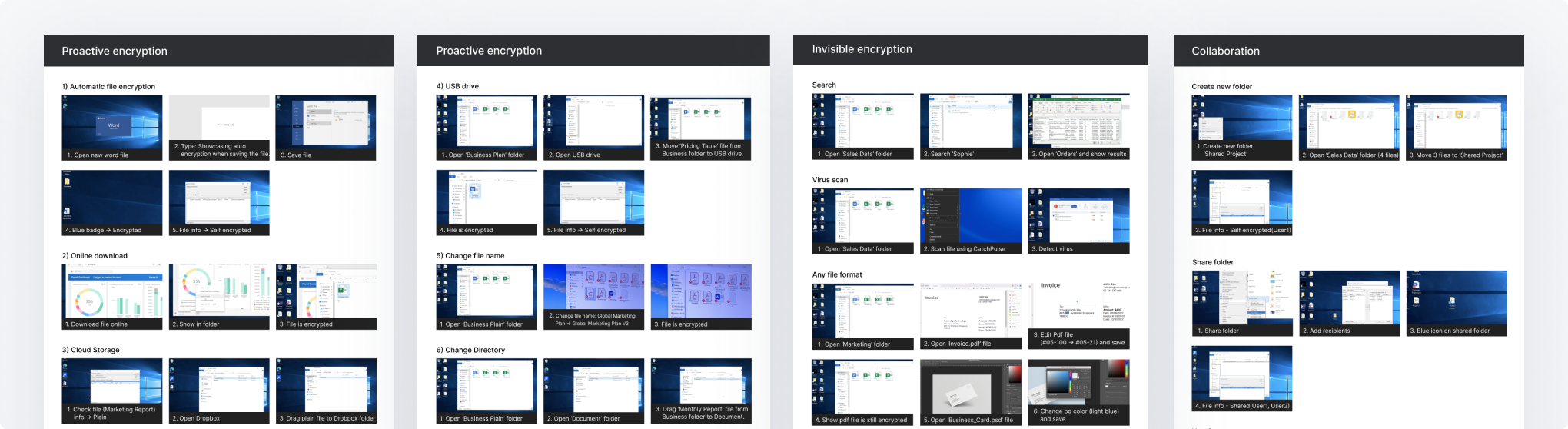
Storyboarding
I created quick sketches and refined them into detailed storyboards using real product screenshots. This allowed stakeholders to align early and iterate efficiently through feedback.
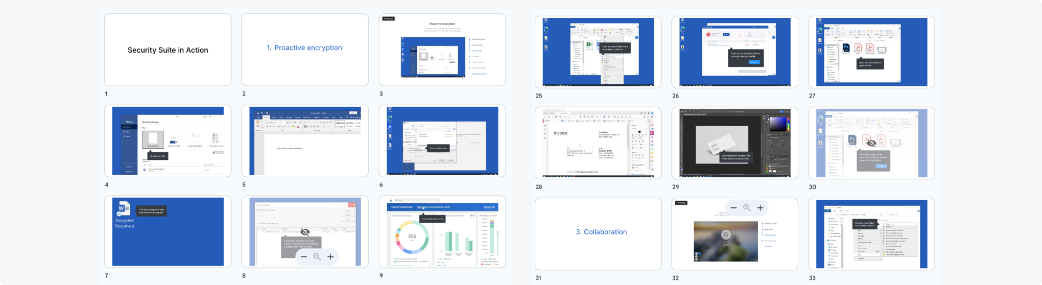
Recording & editing
I collaborated with a sales engineer to capture product workflows and provided guidelines for visual consistency. The recordings were edited into short, focused segments aligned with the intended user flow.
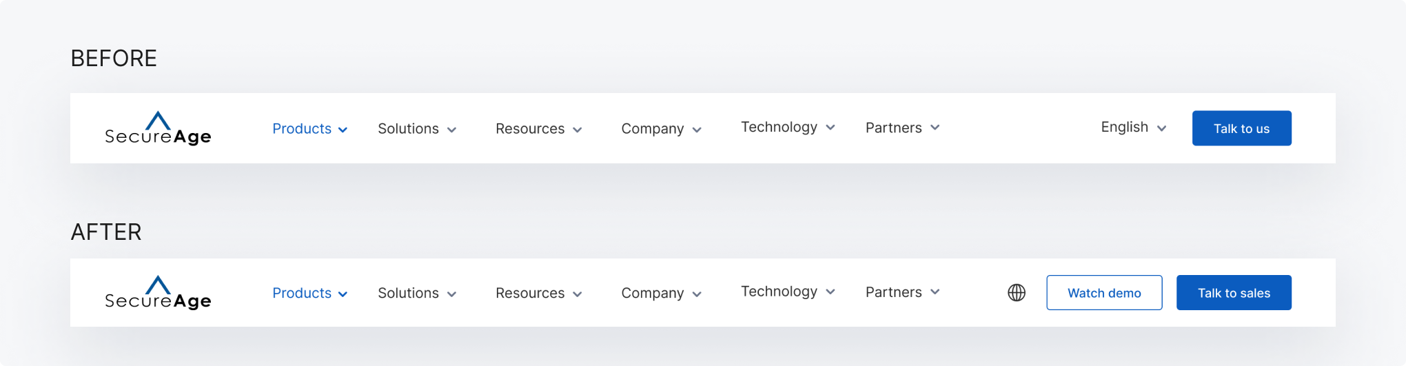
Implementation
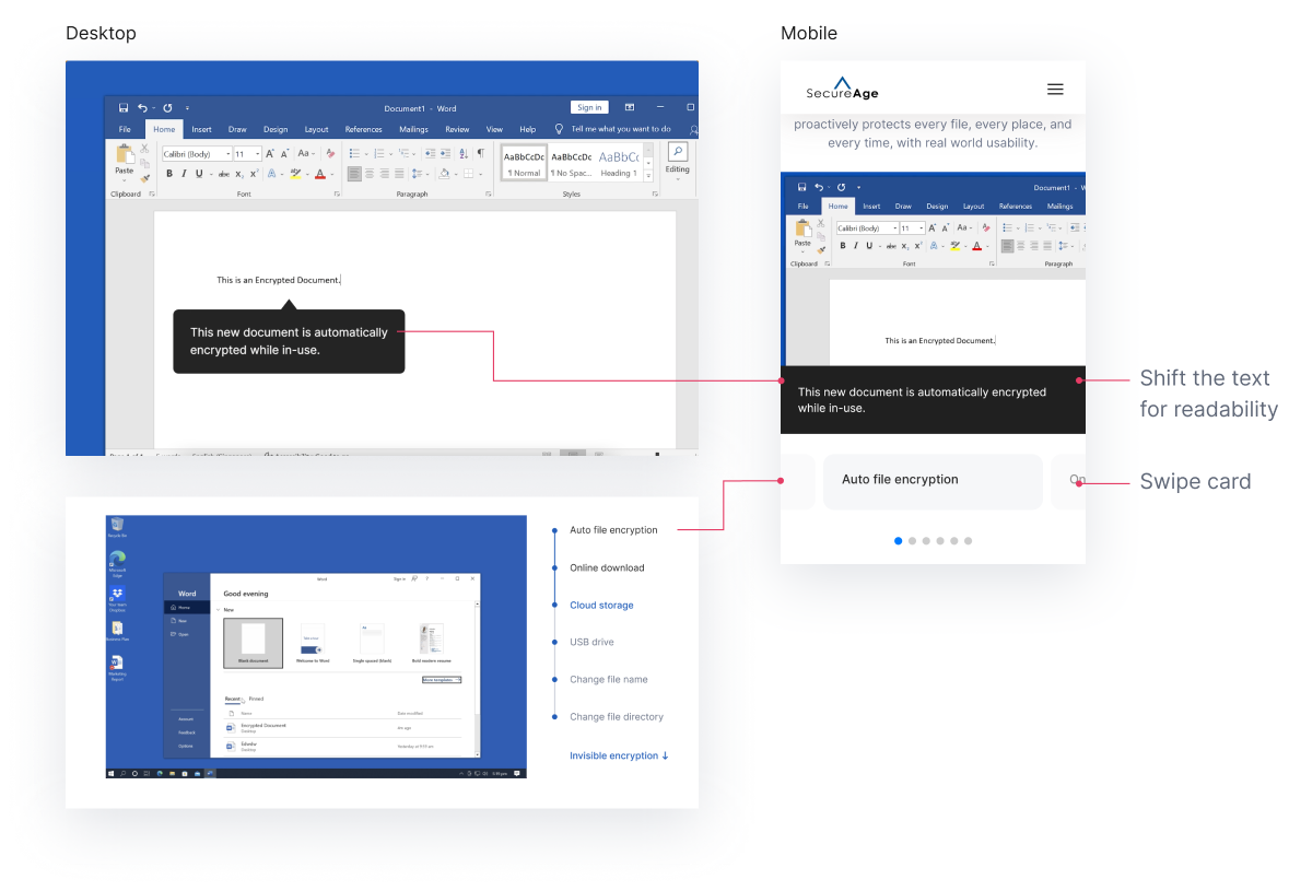
I worked with marketing and a developer to build a dedicated demo page. The experience guides users through one feature at a time with scroll-based progression and click interaction.
Mobile experience
Due to the constraints of screen size on mobile, a different approach was needed from the desktop version. To improve readability, I moved the text content below the screen and designed a swipe-based navigation to move between items, built together with the developer.
Impact
Before this, the company had no way of showing its main product in action online. The experience was explained through text and static visuals, leaving a gap between interest and real understanding. The demo changed that: for the first time, potential customers could explore the actual product interface on their own and understand how it works before ever talking to sales.
It reframed the product experience from static explanation into self-directed exploration, a more honest and tangible way to present a complex security product online.
Reflection
This project helped me better understand how to bridge the gap between product complexity and user understanding in a B2B context. Working closely with sales and leadership teams gave me insight into how customers evaluate cybersecurity products and how early exposure to the product can shape their perception.
I learned the importance of starting with quick iterations, such as sketches and storyboards, to align stakeholders early and reduce rework later in the process. It also reinforced that how a product is experienced can be just as important as the product itself — especially when users cannot interact with it directly at the beginning.